Design Thinking
Stadia
Redesign.
Creating a more familiar gaming platform & experience

Client
Student Concept Project
Role
Research, Design
Timeline
2 Week Design Sprint
Tools
Figma, Google Suite
Challenge
Stadia is Google's cloud gaming platform that let's you stream games without the need of a console or gaming PC. While powerful in its cloud computing, compared to your traditional console (Xbox, PlayStation, Switch) or PC library (Steam), Stadia is difficult to maneuver and oversimplified to the point of user frustration.
Final Designs


Design Highlight #1
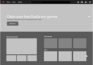
Home: Quick Launch
Easily launch the last six games you've played from the dashboard or see what games your friends are playing without having to open and scroll through your friends list.
Design Highlight #2
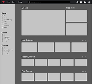
Store: Fast Filtering
Added filtering and navigation makes the store easy to browse. Changing the layout also makes it so you can easily see sales, free trials, new releases with minimal scrolling.
Ensuring a User Centered Design
To obtain qualitative and quantitative data which would be used to help guide design decisions, I conducted a research study focusing on gaming behaviors, user experience with Stadia and other gaming platform interfaces.
Conducted Research Methods

Online Research
I read Stadia review articles and browsed forums to get a sense of people's experience with Stadia.

I interviewed five gamers to learn about gaming behaviors and peoples' experiences / preferences with other gaming platforms.

User Interviews & Affinity Map
I surveyed Reddit's Stadia community to validate my online findings and for quantitative data to help guide design decisions.
Surveys

Competitive Analysis
I looked at current cloud gaming platforms for feature and visual analysis to help ideate layouts during my design phase.

Competitive Analysis
I looked at current cloud gaming platforms for feature and visual analysis to help ideate layouts during my design phase.

Brand Assessment
I looked at current cloud gaming platforms for feature and visual analysis to help ideate layouts during my design phase.
Relevant Insights
People stick to one platform
This means people have a very specific conceptual model of what a gaming interface looks and feels like.
Stadia has poor navigation
Lack of categories makes browsing the store tedious. Users also have to constantly search their library to launch games.
Stadia is oversimplified
When compared to other platforms, Stadia feels lackluster and is missing features available in other platforms.
Defining Opportunities: Home Screen
A challenge for this project was not being able to conduct interviews with Stadia users. From the limited qualitative data I had from my online research and surveys, I knew most of the problems resided in the home screen and store. To find specific opportunities in the home screen, I decided to go through Stadia's homepage as a first time user while also using the qualitative data I had to create a journey map.
Opportunities Found
Make Claiming Games Easier
Claiming Stadia Pro games wasn't as intuitive as it could be. This is something that most first time Stadia users do.
Add More Navigation
Stadia doesn't put the games Library on the primary navigation. This makes getting to the library awkward.
Make Connecting Controller Easier
There are two controller icons near each other, and only one of the icons is the correct place to connect.

Defining Opportunities: Store
Finding opportunities in the store was more straight forward. Many users said browsing through Stadia's store was tedious so I preformed a task analysis on how users would go about browsing for a multiplayer 'shooter' game. I then made a task flow and marked the tedious steps that could be improved.
Opportunities Found
Lack of Filter Options
Lack of filter options makes it very tedious to search for games of specific genres.
Too Much Scrolling
Extra large thumbnails and inefficient layout leads to large amounts of scrolling.
Inefficient Store Layout
Allowing for more content to be shown will make browsing the store more efficient.

Keeping it "Googly"
Because Google has such strict branding, I made sure to understand Google's design guidelines and also created a style guide before I went into high fidelity. Doing so much research into Google's branding and design system may have not been necessary for a redesign but it was a great learning experience.
Style Guide Overview
Typography
From my brand assessment, Google only uses two fonts: Product Sans and Roboto.
Color
From my surveys, people liked the current look of Stadia, thus I kept the color scheme.
Iconography
All icons and components were taken from Google's material design system.

My main focus for the home screen was to allow users to launch more games on the bottom half while still keeping the simplicity of Google products. As for the store I wanted a layout that allowed users to get a bigger overview of the store without feeling too overwhelmed. For the home screen I ended up choosing a horizontal layout with larger thumbnails because it looked too visually cluttered once I started adding content. The store on the other hand looked too stale so I added more variety in thumbnail sizes to make the layout seem more engaging.
Design Iterations
Home Screen Sketches

Home Screen Wireframe

Home Final Mockup
.png)
Store Sketches

Store Wireframe
.png)
Store Final Mockup
.png)
Design Validation Part 1: Home Screen
A majority of users preferred the redesign when asked which one functions more like a modern gaming platform. Users noted that being able to launch more games was more useful than showing your library and preferred being able to see more content on the screen.
Before
-
Only allowed you to launch your most recent game.
-
Layout was unintuitive to users because it differed from standard gaming platforms.
-
Confused some users on how to claim Stadia games and connect your controller.

After
-
Now able to launch your last 6 played games
-
See what games friends are playing and quickly join them
-
Consolidated controller setup into one spot
-
Use screen space for other content users are interested in.
-
Layout more inline with what users are accustomed to
.png)
Design Validation Part 2: Store
Testing the store design was more straightforward. I asked users to perform the task of browsing the store for an action game on both Stadia's store and redesign. All were shocked at the amount of scrolling needed to find 'action games. and felt the redesign made store browsing much easier.
Before
It took over 7 seconds of scrolling to find 'Actions games.'

After
With one click, users can easily see all 'action' games in the store.

Reflection.
Although this was just a student concept project, this was one of my favorites because of how much it challenged my design thinking. Because of Google's reputation, at the time I was very nervous about redesigning one of their projects, and even my instructor at the time warned me that I would really have to dig deep to back my design decisions. Worried that my redesign wasn't a night and day difference visually, my instructor ended up being very impressed at the design thinking I showcased with this project. That being said, there were still many things I could have done better, or avoided:
